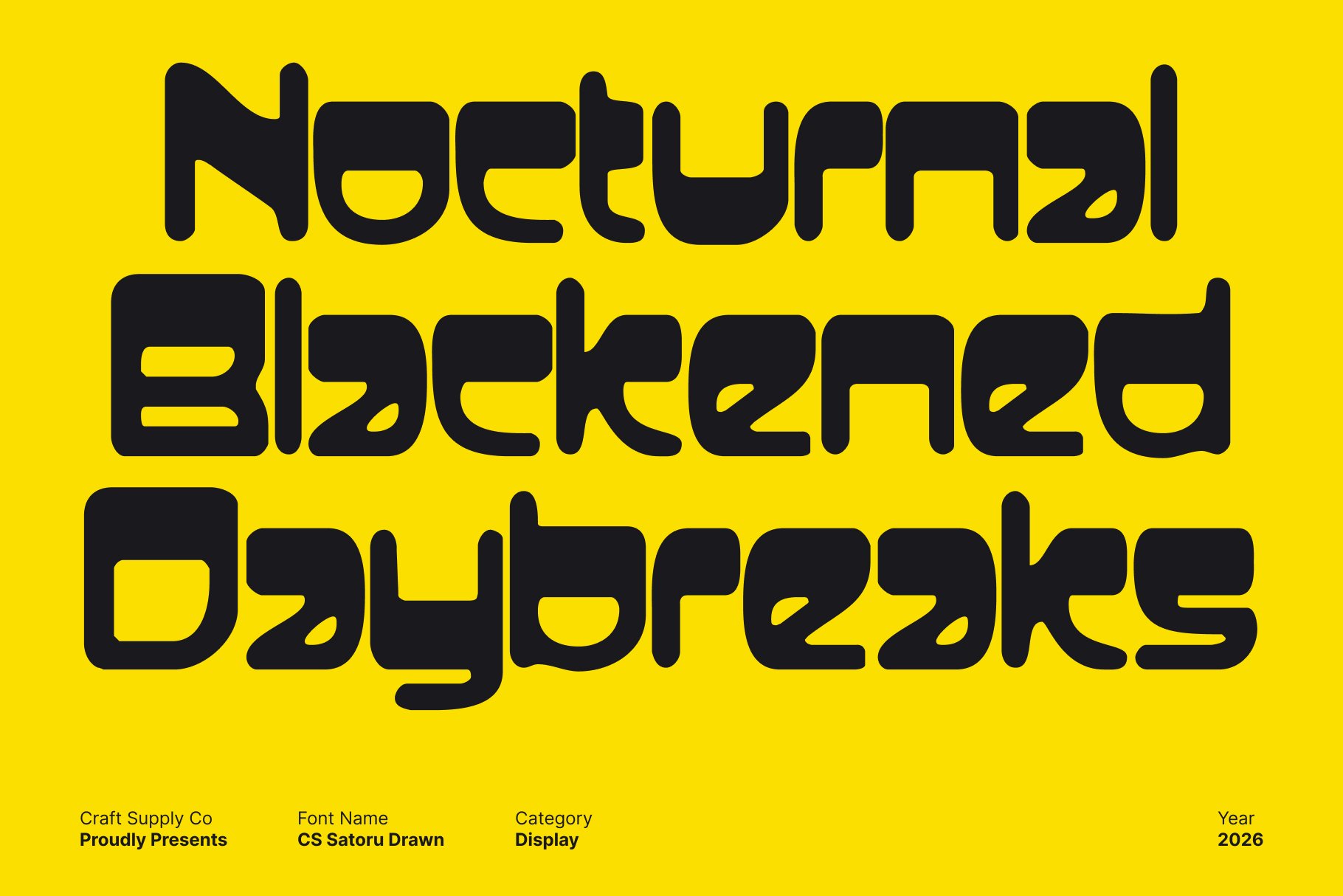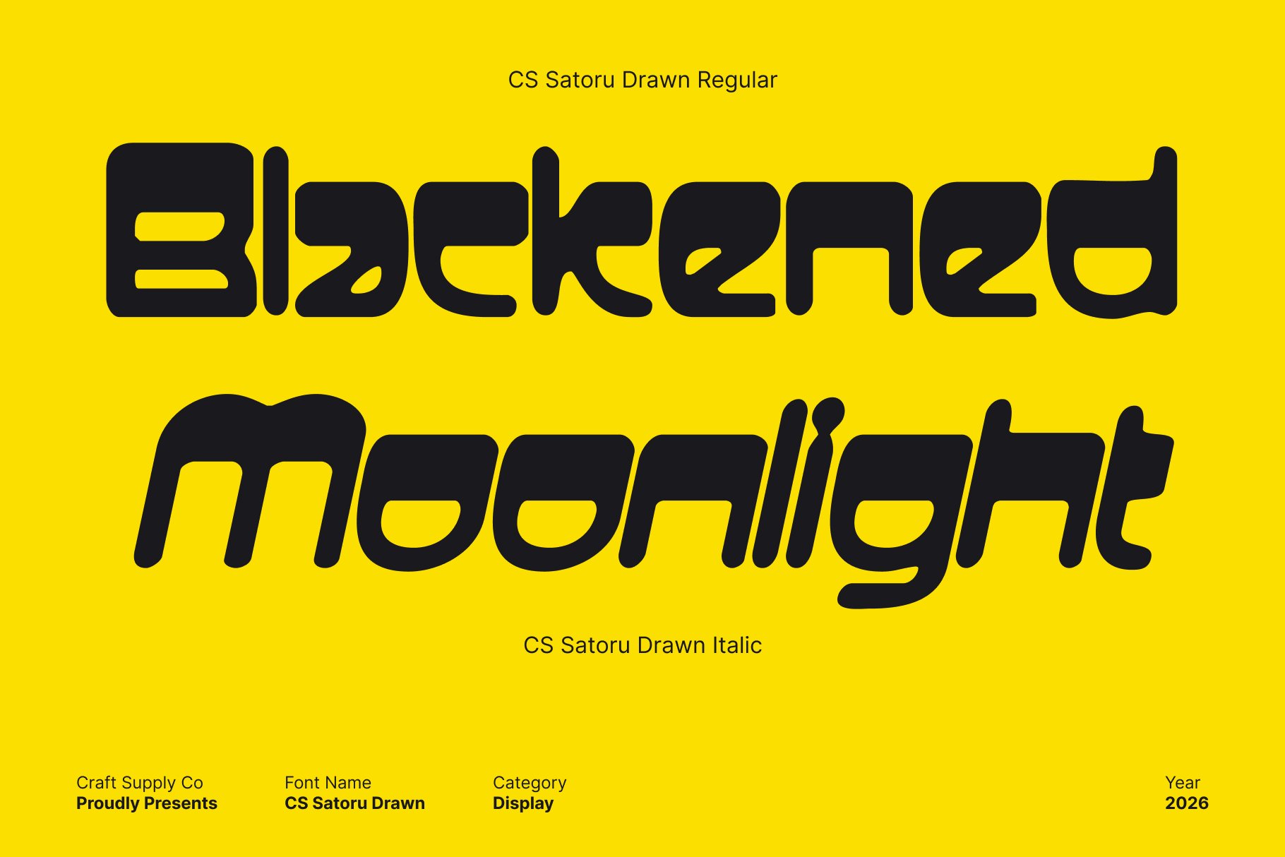
Striking Reverse Contrast Display Design
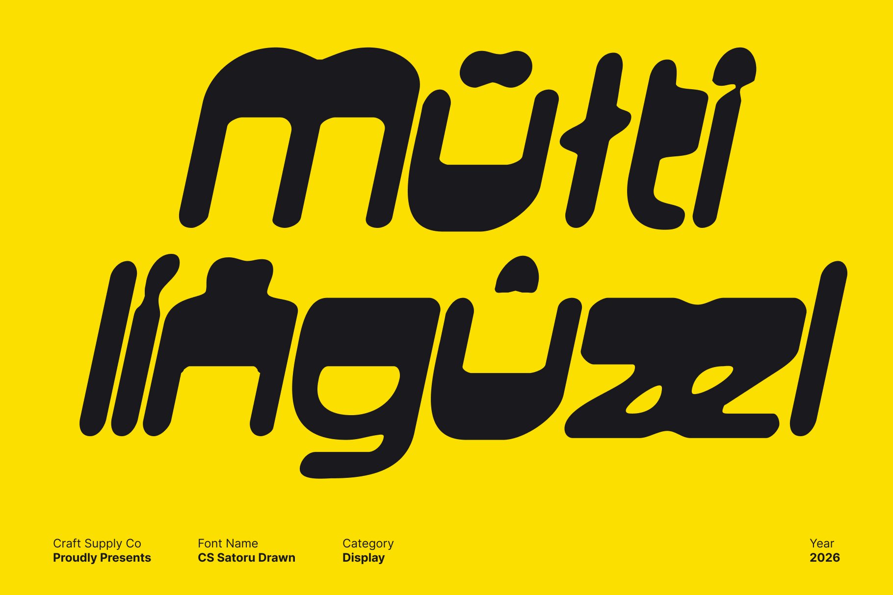
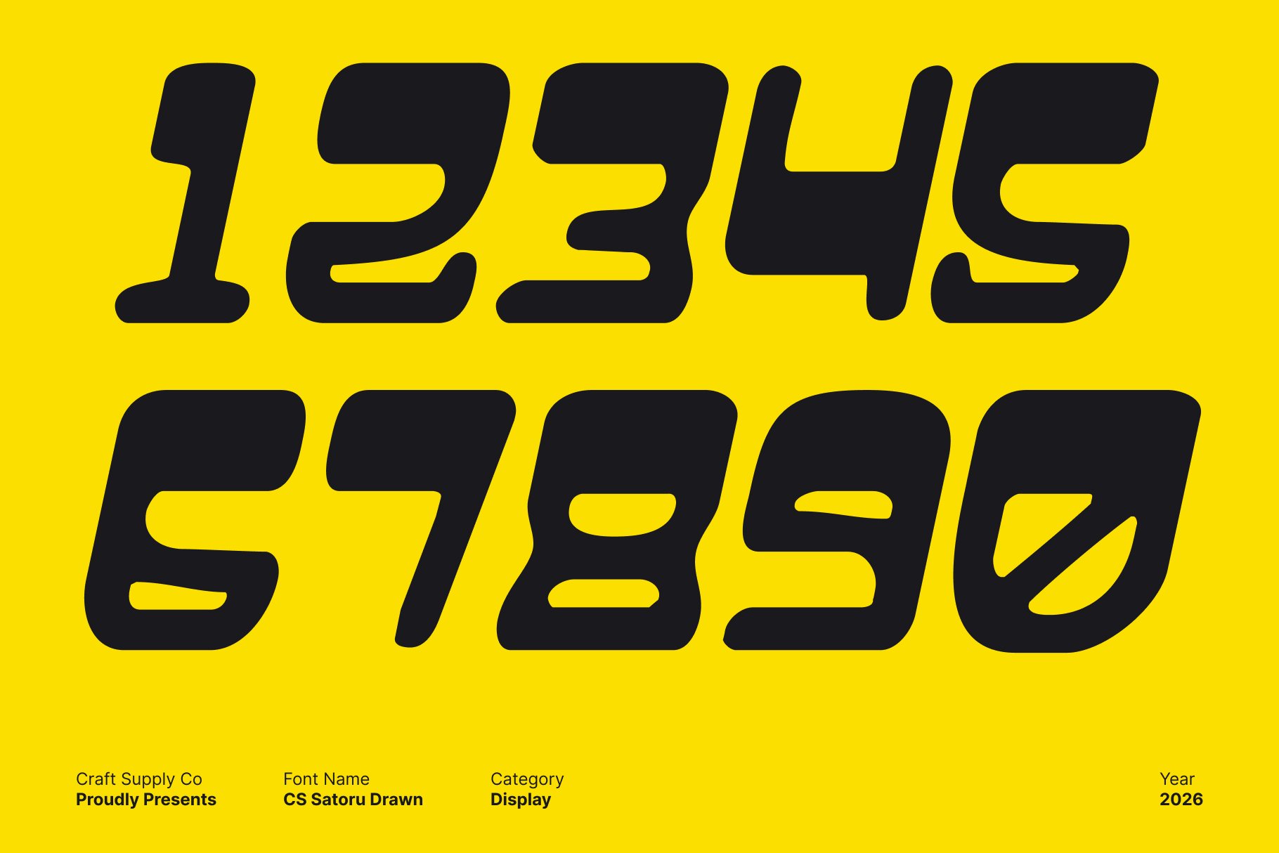
This is a reverse contrast display font that merges retro character with modern confidence. Its bold letterforms and unexpected weight distribution create a dynamic visual rhythm, giving the font a distinctive personality that feels expressive and eye-catching. The reverse contrast approach adds visual tension while keeping the design balanced and readable.
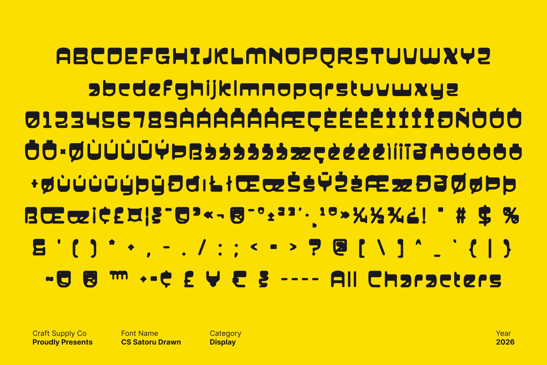
Modular Structure with a Drawn Character
Built on modular, geometric foundations, this font reflects classic design influences while introducing a hand-drawn texture that softens its structure. The drawn details add warmth and originality, preventing the geometry from feeling rigid. This blend of precision and imperfection results in a font that feels both structured and lively.
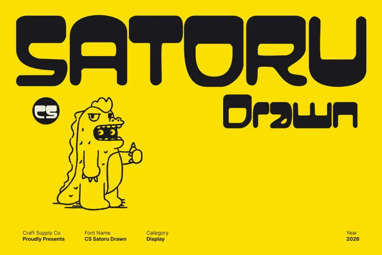
Strong Presence for Branding and Editorial Design
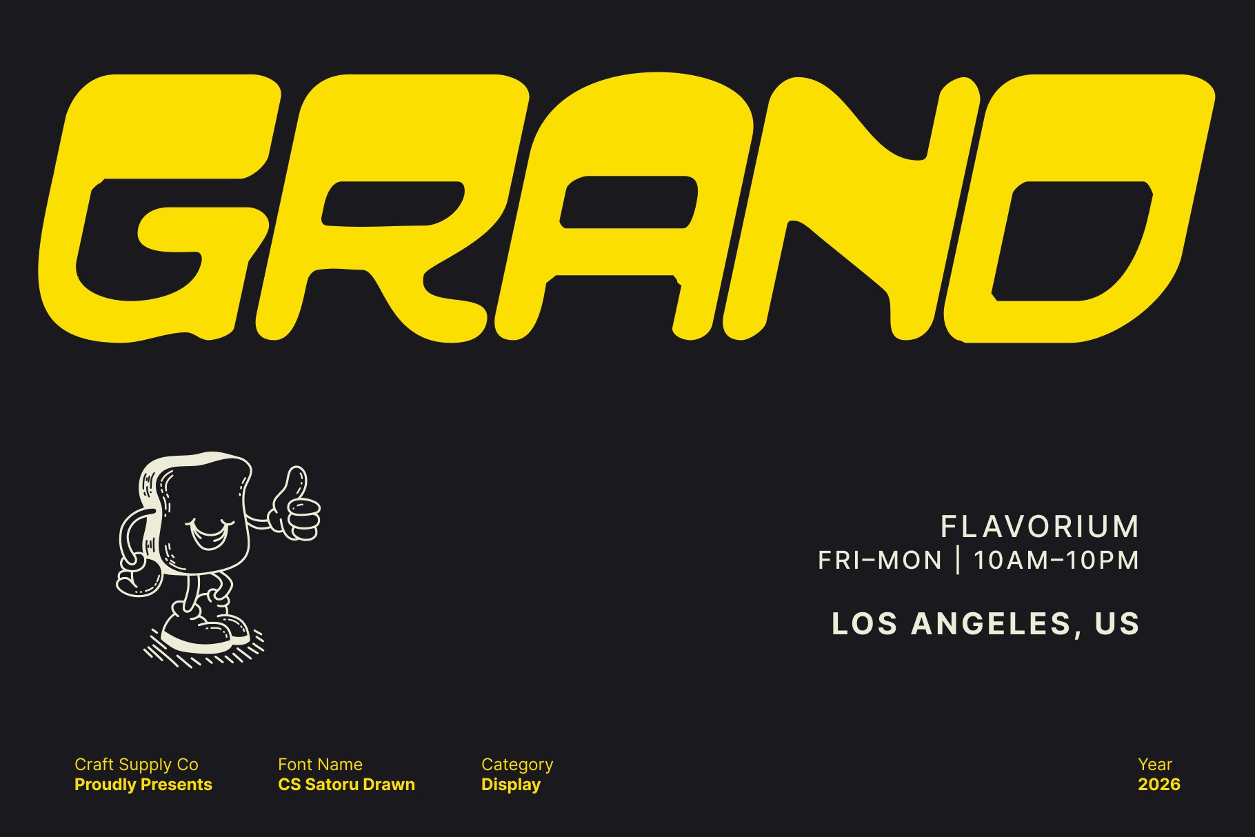
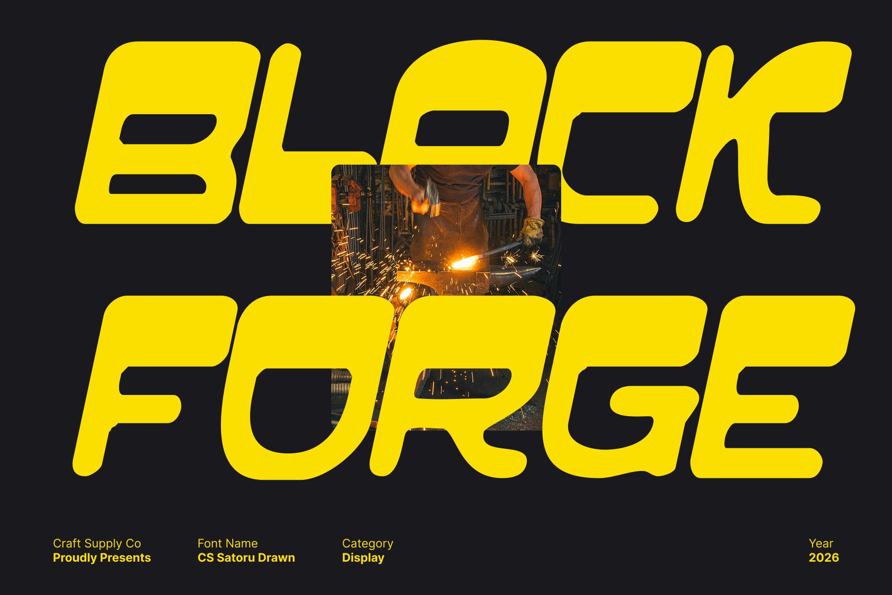
This font excels in posters, branding, headlines, and editorial layouts where impact is essential. Its confident form and expressive contrast naturally command attention, making it ideal for designs that need to stand out while maintaining clarity and sophistication.
Retro Spirit with Contemporary Versatility
Capturing the essence of vintage typography with a modern attitude, this font adapts effortlessly across creative applications. From bold branding to promotional materials and experimental layouts, this font delivers a powerful mix of nostalgia, innovation, and drawn personality.