Quiros Rough Font – Retro Boldness with Textured Attitude
Striking Reverse Contrast for Bold Visual Impact
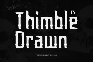
Quiros Rough is a display serif font that flips traditional stroke weights on their head. Featuring reverse contrast, where horizontal strokes are thicker than vertical ones, it delivers an unexpected and captivating visual rhythm. This design choice not only enhances uniqueness but also gives every letter a bold, expressive stance perfect for catching the eye.
Rough Texture for Gritty Personality
The rough texture finish brings a raw, handcrafted feel that adds depth and organic character. This tactile quality sets Quiros Rough apart from cleaner display fonts, making it feel more vibrant and authentic. It’s ideal for projects that want to inject a bit of imperfection and artistic flair, while still maintaining strong typographic structure.


